Hi, my name is Jenn.
I’m a WordPress ninja, web designer and big thinker.
I’d like to help you. And as I’ve told many people over the years, I haven’t met a site I couldn’t WordPress yet.
Are you:
- A designer who loves to design websites, but doesn’t know a lick of code (or hates code)?
- Looking for someone to collaborate with to build a function-rich site with lots of content?
- An agency who needs some web development help or someone on your team who can help shore up your current resources?
- A fellow designer or a photographer or an artist or someone who needs to showcase a portfolio but doesn’t want to bang your head against the wall trying to keep it updated?
- Just looking for someone vivacious, enthusiastic and fun to work with?
Pull up a chair and let’s chat. You’ve come to the right place.
Maybe you’d like to learn more about me, available services, or drop a line about your project.
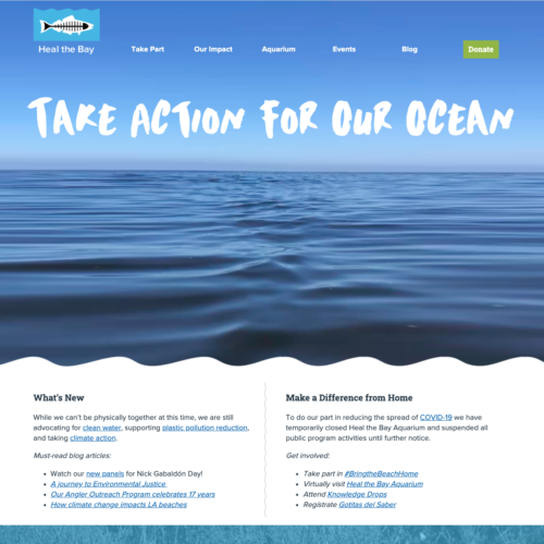
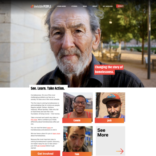
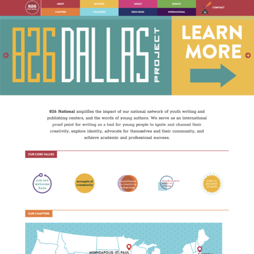
Or you could just look at some work: